Nate Dickson

What I think.

Announcing Five A.M. Radio

So, between a full time job, continuing work on Painless Tmux and home stuff I decided I don’t have enough to do. And a good friend of mine decided the same thing. Together we took these decisions and turned them into a new podcast, which I’m excited to share with you. This new podcast is called Five A.M. Radio.

Why Is It Called That?

Five A.M. Radio was born out of Michael Boyle and I talking and playing games at right around Five A.M. every morning. We’ve been friends for years, and recently through Steam we’ve noticed that we both get up a lot earlier than we need to if all we wanted to do was get to work on time. And we started talking about the sort of things we do in that early morning free time. Sometimes we play games, sometimes we work on projects (like writing books), sometimes we just watch movies or TV shows, but basically it’s all just “whatever is exciting enough or interesting enough to get us out of bed early.”

So Five A.M. Radio is an eclectic mix. We have five episodes up already, and more in the pipeline. It’s a weekly show, giving you a little half-hour dose of our commentary on such fascinating things as keyboards, Magic the Gathering, Kickstarter, and, like I said, pretty much anything that catches our attention.

I hope you’ll check it out. The website is fiveamradio.com, where you can listen to each episode, and it has links where you can subscribe to the podcast in your favorite podcast manager. If you have any feedback you can hit us on twitter as @fiveamradio, or email us at hello at the domain of the show, listed above. I’d love to know if there are any shows you’d like us to do.

Douglas Adams and JavaScript

I was brushing up on some JavaScript for work and came across a problem that has bugged me before: testing for NaN1. I’ve never dug too deeply into this one, I’ve just known that if you try something like this:

1
2
3
4
5
6
7
var a = NaN
if (a == NaN){
   //a is NaN, do something
}
else{
   //a is a number, do something else
}

The code would always do something else. so I usually found a different way to solve the problem.

Today I actually dug into it and found that in JavaScript the value NaN has some odd properties:

  1. It’s a number.
  2. It is the one value in JavaScript that can never equal itself.

So that’s annoying, but actually lends itself to a very easy solution: if you want to test if a variable is NaN you can test it like this:

1
2
3
4
5
if (a !== a){
	// a is NaN
}else{
	// a is a number
}

But people who are good at JavaScript already know this. This is not news.

What struck me about this is that Douglas Adams invented a word for this kind of value:

… a recipriversexcluson, a number whose existence can only be defined as being anything other than itself. Douglas Adams, *The Ultimate Hitchhiker’s Guide to the Galaxy (p. 345). Random House Publishing Group. Kindle Edition. *

Somehow this made me actually like JavaScript more.


  1. If you don’t know, NaN is a special value meaning “Not a Number” and is used to check if the variable you’re working with actually has numerical data.

PSA: Deleting Songs of Innocence Will Cancel Christmas

News of the backlash against U2’s Songs of Innocence has reached the North Pole. Santa Claus today has released a statement:

There was a time when people enjoyed having an old guy sneak into their house and give them free stuff. As my good friends Paul [Hewson] and Tim [Cook] have seen, that time has passed. So I am warning anyone who decides to use the “remove Songs of Innocence” tool. I wanted to announce that I will also be removing your name from my list of annual visits. Thank you.

We Were Young, Not Dumb

I like U2, although their last couple of albums have been a long downhill slide and it’s unlikely that I would have purchased this one. So in one sense, I’m okay with Apple buying the new album and giving it to me gratis.

And I suspect that for a lot of people the album itself isn’t the problem. As one of my friends put it:

…for me, it’s a weird boundary issue. Like, I’m fine with someone sending me a free CD in the mail, I’m less fine with a CD randomly appearing on my coffee table while I’m at work.

None of us like reminders that our devices are only “ours” on the surface. We try not to acknowledge that Apple1 reigns supreme on the device. We like the illusion of security and privacy, and anything that erodes that illusion creeps us out.

For others, of course, the album is the problem. I trust Apple to allow me to buy whatever music, books, movies, and apps I want without censorship or oversight2. I want them to keep my music library safe, and keep it mine. I don’t want them dictating what constitutes “good music” to me. I like U2, so I’m not bothered by this particular album. But if Apple had shoved a John Meyer or Beyoncé or (more plausibly) Dr. Dré album into my iTunes library I would have been incensed.

So, Bono Claus, if you’re reading this3: next time you want to give us something for free please just knock instead of coming down the chimney.


  1. Or Google, if you’re using Android

  2. okay, with some censorship and oversight. Quite a bit, actually. But you know what I mean.

  3. he’s not.

Possible Titles for Painless Vim

I was going through some old scraps of things I’ve written and found this brainstorming list of possible titles for my then-upcoming book on vim. before I settled on the current title. I kind of like some of these, but overall I think I went for the best one.

Vim Book Titles

  • Vim in One (Long) Day
  • Long Day’s Journey into Vim
  • Gradual Vim
  • Vim for Smart People Who Could Use a Little Help
  • Vim for the Wise
  • Growing into Vim
  • Reluctant Vim
  • Painless Vim
  • The Sane Person’s Guide to Vim
  • Vim for the Sane

I really liked Long Day’s Journey into Vim, but that cover would have been hideous and it didn’t really have the “friendly and breezy” vibe I was going for. Ditto Reluctant Vim.

Returning to Opera

I love Opera. I love that they’ve kept the faith, kept making an actual for-profit browser for decades, long after the browser crown has gone to, well, everyone else over and over. I love that their little team keeps after it, keeps trying, and keeps making the most innovative browsers on the market, and then doesn’t turn around and sue everyone else for copying their best features1. Back when IE 6 was still the reigning champion and Firefox was still called Firebird I actually paid for an Opera license, and I would do it again in a heartbeat if they went back to a paid browser model.

Over the years, however, I have used the other darlings of browser-land, like everyone else. Firefox was my browser of choice for years, followed in due course by Chrome, and recently another stint with the ‘Fox, when it became obvious that Chrome was basically just inviting the NSA and advertisers to look over your shoulder the entire time you’re on the internet.

And I’ve loved my time with Firefox. No, it’s not as fast as Chrome. It never will be. But it’s (finally) also not as memory hungry, and is actually a pretty good citizen. And Firebug is a developer’s dream, of course. All in all it’s a very solid browser, and I have no real complaints.

So why leave? What changed my mind?

Heading for the Coast

There are a couple of things. The first one was Opera Coast, the world’s most interesting browser. Opera once again decided to take a look at what a browser UI should look like and decided that everything that had happened up to this point was wrong and started over. Coast operates under the assumption that either you are going to go to one of the four or five (or ten or twelve…it doesn’t judge) sites you always go to on your mobile device and shows you those. It says this right on the website:

We don’t care what you do with your time. We just want to make sure that if you decide to waste a little, you do it well. And, there’s no better browser to help you pass some free time.

Everything about Opera Coast is tuned to this ideology. You’re probably going to waste a few minutes on one of your regular sites. That’s cool, here’s an icon for it. But what if you want to go to a different site? Well, if you are going somewhere new you are going to do a search, right? Okay, pull down to search. Watch the awesome search thingy figure out what you’re looking for and start pre-loading sites while you’re still typing. And if you’re feeling even less directed the search area will show you a list of good time wasting sites without searching at all, a feature I have used more than once. If you decide you like one of these new sites you have the option of adding a chip to the home screen, making it that much easier to come back to the next time you have a few moments to kill.

All the techy parts of the browser are gone. You don’t have an address bar. When you are on a page there is zero chrome around the page except a little shortcut back to the home screen. All the interactions are intuitive and fluid. Opera has made a browser that actually makes sense on a phone.

Back to the Desk

So, having discovered Coast, I decided to see what desktop Opera looks like these days. It’s been a few years since I’ve tried it out, and it deserved another look. And a lot of the end-user consideration that has gone into Coast has gone into the desktop browser as well. Speed Dial, another Opera invention, has had a facelift and now is almost iPad-like in it’s use of tiles and folders. The new “Stash” feature lets you grab pages that you are visiting frequently for a while and keep them organized and visible. I can see this being helpful if you’re following a particular event and want to keep some sites handy while that event is going on, but once it’s over you can clear it out of your Stash and move on. This is definitely a psychological divide (it’s not that hard to delete bookmarks) but it works well.

And, again, if you’re just looking to kill some time you’ve got a Discover tab a la Coast.

Under the hood, Opera is using WebKit, the same engine that powers Chrome and Safari, so it’s sufficiently speedy and does all the typical browser stuff just fine. But the additional thoughtful touches in the UI have made it my current browser of choice.


  1. Tabbed browsing, browser extensions, and a “speed dial” new tab screen are three highlights of Opera’s huge list of firsts.

Getting Back Into Podcasts With Overcast

Back when I first got an iPod Touch I was way into podcasts. There were some weirdly terrible ones back then that changed me, man. But for a while my biggest reason for listening to podcasts was because I was commuting, and I needed something brain-stimulating while I was on the road. Ever since I moved closer to my worksite, however, I’ve been doing far less with podcasts, and I realized that I actually miss it. So I decided to get back into it.

My mistake, unfortunately, was that I did some research before trying to get back into podcasts. I should have just downloaded the apple podcasts app and gone on from there. But that’s not my style. Long story short, I didn’t really listen to any podcasts at all for a few months while I decided which app I wanted to use. In my wanderings I discovered that Marco Arment of Instapaper fame was making a new podcasting app called Overcast. This made me happy; I have loved Instapaper for years1, and I respect his appreciation for minimal presentation around the content.

So I waited for Overcast to actually come out, again, putting off my dive back into the world o’ podcasts. I played with Downcast for a while, but wasn’t in love with it.

So, Overcast came out, and I wasted no time downloading it and getting back into the world of people talking at their computers.

And I’m quite impressed2. Every part of Overcast shows signs of methodical, reasoned, intelligent design and execution. Which is quite a claim to make of a podcast player, I realize. I mean, all it has to do is mash an RSS reader with an audio player, right?

Well, sure, but you can do so much better. Podcast listeners have gotten used to a few things; they want their shows intelligently managed, downloaded (and removed) according to a schedule and without undue fussing. They want to be able to speed up speech-only podcasts, because you can listen much faster than people can speak. They want to find new and interesting things to listen to in-app.

And Overcast provides all of this, with aplomb. Everything is simple, easy to hand, and easy to use. But they added a few nice touches that I haven’t seen elsewhere. My favorite is “Smart Speed”, which intelligently goes through and deletes pauses and breaks in the conversation, but in a very natural way. I have literally no idea how it does it, and indeed, I wasn’t even sure it was doing it for the first few times I used it, because everything sounded so natural. Occasionally it will get stuck in the middle of someone’s vocal gesturing and make them sound a bit robotic, but this is rare. For the most part it just saves me time without getting in the way.

And Overcast includes even more awesomeness in the form of the overcast.fm website. If you set up an account it will keep track of your status across devices, and also gives you a web player which also stays in sync. I created a Fluid app for Overcast on my macbook pro, which lets me listen transition from the iPhone to the desktop without missing a beat.

Finishing off the excellent features of Overcast is Marco himself. the @Overcast twitter account is where he responds to user requests and questions, and he is listening, yo. Overcast is evolving based on user feedback, quickly and, again, intelligently.


  1. Until I discovered Pocket. But I already covered that.

  2. Both with Overcast and with how podcasts have progressed in the years since I last l listened to them.

Fully Custom Keyboard

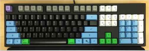
Thanks to all the amazing people who bought Painless Vim I’ve got a little bit of spare cash to put into things that make my job easier. I’ve had my eye on one such convenience for quite some time now: a customized mechanical keyboard.

For those of you who aren’t insane, mechanical keyboards are a big deal these days, amongst people who think too much about their working setup. If you want to know more about why mechanical is the way to go I suggest reading this excellent article on Lifehacker that covers it nicely.

Anyway when my recent royalty check came in from Leanpub I realized I was finally in the position to fulfill an old dream of mine: buy a fully customized, fully mechanical keyboard.

A few years ago I found out about a company called WASD Keyboards, and they are delightfully obsessed with making top of the line keyboards that fit you. Not you, the general purpose programmer, not “you” the one-size-fits-all gamer, you, individually. If you want your keys to be in alternate rows of white and yellow they can do that for you. If you want all your keys totally blank, the HJKL keys red and everything else black, that’s cool, they’re on it. However you want to do it, they will do it. You can design your dream keyboard on their website, choosing from several different key layouts, and the ability to specifically color every single key on the board. If the customization on the site isn’t specific enough you can send them a file with exactly how you want every key printed, and they will do it.

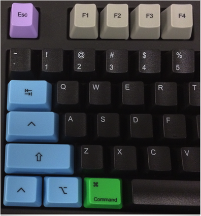
On my keyboard there is no such thing as "Caps Lock"

And it gets better. WASD is in the business of keyboards and keyboards only, and they listen to their customers. The V2 models have a series of DIP switches on the bottom that let you customize all the good stuff. Things like “Make Caps Lock into a third Ctrl button” for us vim fans.1 Things like “swap the Alt and OS keys” for us OSX fans. Things like “Switch to Colemak or Dvorak” for people who take their typing seriously2. All these switches are handled on the keyboard itself, so you don’t have to mess around with system settings.

If you are crazy like me and care about the details, I got this keyboard with Cherry MX Clear switches, which have a nice tactile bump halfway down, at the actuation point. If you understood that sentence, welcome to the club of people who should sleep more and study keyboards less. Pull up a chair. If you didn’t, it’s nerd speak for saying “I can push the keys halfway down and they register, which is easier on your fingers, and when they register there’s a little bump you can feel letting you know the key registered.”

The build quality is quite high3 from what I’ve seen so far, with a nice weight to the keyboard, excellent motion on every single key, and sharp, laser-etched inscriptions on every keycap.

I guess if there is a point to this post it’s twofold:

  1. Thank you, All of you, who have supported me in my writing.
  2. If you’re looking at getting a mechanical keyboard you should seriously consider WASD Keyboards. You won’t be disappointed.

And now, back to work on Painless Tmux! 😃


  1. You’ll notice my keyboard has the Ctrl Symbol on the Caps Lock key. My keyboard is now 100% Caps Lock free.

  2. I’m not there yet. I may never get to the point where I try one of the alternate layouts. I used to say “never” about things like that, but after years of saying I’d never learn vim I suddenly changed my mind, so I’m not closing the door entirely.

  3. As might be expected of the company that Jeff Atwood chose to make his line of CODE Keyboards.

Using Vim and Scrivener Together

I’ve been working on Painless Tmux and trying to apply a lot of what I learned while writing Painless Vim to make the process easier and more streamlined.

And one of the problems that I’ve been beating my head against is this:

Tables.

Tables in Markdown are a mess. Understandably so, because you’re trying to keep everything nicely lined up in plain text, which just doesn’t happen. Compound that with proportional fonts in Scrivener and you have something that nobody should ever have to look at. There’s a couple of problems here, of course.

The first is that it’s easy for bugs to hide in messy code1, and I’ve had to run my manuscript files through Leanpub’s markdown generator multiple times before I got my tables right.

So: step one: after putting all the data in a table let’s get the table all lined up and looking nice. This is where vim steps in. Specifically, vim with the Tabular plugin.

Using Tabular I can turn a table that looks like this:

| Heading 1 | Heading 2 |  
|  ------ | ------ |  
| some text | A second bit o' text |   
| Still more text, this time of a different length | small text	| 

into this:

| Heading 1                                        | Heading 2            |
| ------                                           | ------               |
| some text                                        | A second bit o' text |
| Still more text, this time of a different length | small text           |

all by typing :Tab /| in vim2.

So far so good. But when I paste this back into Scrivener it looks terrible again, because Scrivener uses proportional fonts3:

This was an even easier problem to solve, I just didn’t realize it it until today. Scrivener lets you use all kinds of rich text features while writing, all of which it ignores when exporting or compiling your text for output. This means, of course, that I can style my tables with a monospaced font and suddenly they line up the way they were supposed to all along.

But changing the fonts manually every time I make a table is a drag. Enter the “presets” feature that Scrivener uses. Its basically the Apple “Styles” menu, but enhanced and made more Scrivener-like. All I had to do was highlight the monospaced section, then in the menu go to Format->Formatting->New Preset From Selection and now I can make any of my text nicely monospaced with the click of a button. And while I was at it I re-styled the “Body” preset to be the the way I (currently) like it.

So there you have it: a couple of simple, common sense tips for making tables less of a nightmare in your Markdown manuscripts. Enjoy!


  1. or semantically marked text. Stay with me here.

  2. See Aligning Text with Tabular.vim for a full explanation of how the plugin works.

  3. Sure, you could use monospaced fonts in Scrivener, but not in my Scrivener. Unless I’m writing code I like my fonts properly kerned, thank you.

Introducing Painless Tmux

For about the last year I’ve been working on Painless Vim, and really enjoying it. I’ve learned a lot about writing, and of course I’ve learned a lot about vim. But for the last little while it’s been slowing down. I’ve written all the text, and I’ve been through a few rounds of revisions, both from changes made by editors and from changes suggested by readers. And now it’s pretty much done. Sure, there are a few revisions left to make, but they’re nothing compared to the work I’ve been putting into it over the previous months.

So I decided to write another book. You see, I realized that, while I use vim for basically all my programming work, that’s only half the story. Vim is great, but there’s no real reason to use a terminal based text editor if that’s all you’re doing from the terminal. And for the past year or more, while I’ve been learning and writing about vim, I’ve also been using tmux to get more out of my terminal, and to compliment and augment vim’s power.

So I’m writing a book to compliment and augment Painless Vim.

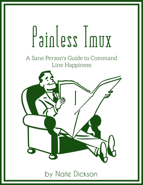
Painless Tmux is brand new, and as I write this it’s only 15 pages long. There’s a lot of life ahead of it, and I’m really excited about this one. For one thing, tmux is so much easier to use and to learn than vim. Especially if you’re already using vim.

Together, vim and tmux let you do pretty much everything, all from the keyboard. so, I’m also offering the two books as a bundle, for significantly less than buying them separately. Basically if you buy the bundle you get Painless Tmux for a dollar.

When I started Painless Vim I didn’t really know what I was getting myself into. I figured it would take a month, tops. Well, this time, I do know what I’m getting myself into and I’m excited to get into it.

Walking Home With Chicago Avenue Moon

Heading out, leaving work. It’s about two miles home, an easy half-hour walk. What’s more, it’s all downhill. I decide to let Chicago Avenue Moon do its thing while I walk. Let’s hear some procedurally generated tunes.
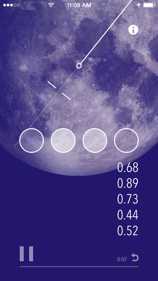
The UI doesn’t tell me much; or rather, it does, but not in a way that I can understand. A string of numbers running down one side of the screen slowly starts filling in, going from all 0.00 to…other numbers. Probably based on my walking speed? A line swings across four circles, highlighting them…and that’s it. But it’s time to put the device away, time to walk.

The sound starts slowly…a quiet susurrous of static is all for a moment, then a gentle swell of strings, maybe?

Slowly the sonic landscape fills in: quiet, layered sounds give way to rising waves of music. It’s like having an audio-only link to some other world. This isn’t music I’ve heard a thousand times before, this is something new and unique, being created by my walk, and it opens my eyes.

I’ve seen everything along this route hundreds of times, but I’m seeing it more clearly this time. Bright, living green grasses under a mottled gray cloudy sky. I’m more aware of colors than I’ve been in a long time, I’m open to the feeling of the wind…and presently the rain.

I pull my umbrella out of my messenger bag and pop it open, imagining what I might look like from above. A drab, office-worker colored stalk, watered by the rain, suddenly bursts into a bright red and white flower fighting the wind.

The sounds of wind and rain fold themselves into the music from Chicago Avenue, and in my quiet and dreamlike state it’s easy to believe that whatever mathematical equations are controlling the sounds are also orchestrating the storm, for as soon as I turn a corner the rain slows, then stops. The music, too, changes gradually, adapting to my new position and heading. The whoosh and hiss of cars driving past in the rain…it’s all one.

At length I turn the corner onto my street, and one by one the layers of music fall away, leaving only a slow, stately tone, rolling in grand waves, and fading slightly, a fitting end to a walk in another world.


Chicago Avenue Moon is an oddity on the App Store. Created by JuneCloud, who are best known for their package tracking app , it’s a pure work of art, and one that succeeds. According to the website, it was originally the vision of Joshua Dumas, a musician who wanted to

…help re-enchant a person’s daily commute, trip to the laundromat, or evening jog.

A worthy goal.

The app really does create a soundscape that is throbbing with life, full of strange, alien combinations, and occasionally overlaid with bursts of static, as if you really were channeling this music from somewhere far away.

It may not be the perfect soundtrack for every single day, but if you want to include a little bit of mystery into your daily wanderings it’s definitely worth a try.